Launch in Days, Not Weeks
Professional one-page website — only a few slots left this month
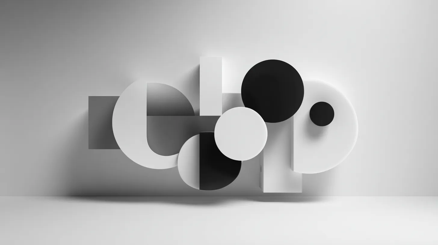
When founders first see Fernside Studio’s monochrome aesthetic—cool greys, icy blues, restrained blacks and whites—the question often follows: “Won’t this be too boring to convert?” The assumption is understandable. We’re surrounded by bright CTAs, saturated gradients, and marketing sites shouting for attention with every colour in the palette.
Yet the data tells a different story. Cool, muted, monochrome colour schemes consistently outperform visually busy designs for conversion rates, particularly in service-based SMB contexts. The restraint isn’t aesthetic preference masquerading as strategy—it’s strategic restraint backed by psychology, usability research, and A/B testing outcomes.
Here’s why icy colour palettes work better than most founders expect, and when to deploy them for maximum impact.
Before exploring why cool palettes win, understand what they’re competing against: visual complexity that overwhelms visitors before they can process your value proposition.
Recent research from Stanford and applied ergonomics studies consistently demonstrates that visual complexity directly impacts cognitive load and user performance. A December 2025 study specifically examining interface design for mobile users found that visual complexity significantly affects cognitive load, with colour choices modulating this effect substantially.
When visitors land on your site, their working memory has limited capacity. Every visual element—colour contrasts, patterns, gradients, illustrations—consumes cognitive resources. The more complex the visual field, the harder it becomes to focus on content, understand messaging, and make decisions.
Here’s the critical finding: visual complexity results in increased reaction times and decreased recognition rates. Users exposed to visually complex sites show higher experienced arousal but more negative valence appraisal, decreased heart rate, and increased facial muscle tension. In plain terms, busy sites stress visitors out while making it harder for them to remember what they’ve seen.
For SMB websites where the goal is generating qualified enquiries, this trade-off is disastrous. You’re sacrificing message clarity and decision-making ease for visual stimulation that doesn’t serve conversion.
Cool, muted palettes solve this by removing decision fatigue. When your site uses restrained colour—predominantly neutrals with one or two strategic accent colours—visitors can focus entirely on content. Their cognitive resources go towards understanding your offer, not processing visual noise.
This is why Fernside Studio defaults to monochrome layouts with minimal colour accents. We’re not trying to be memorable through colour variety; we’re ensuring your message lands without competing against visual distractions.
Beyond reducing cognitive load, icy and muted colour palettes signal specific qualities that directly impact conversion: professionalism, trust, and considered thoughtfulness.
Research investigating colour as a trustworthiness cue in websites tested over 200 participants evaluating finance, legal, and medical websites. The study found that colour scheme alone influenced perceived trustworthiness, even when content and structure remained identical across variations.
Blue tones, in particular, consistently increase perceived trust and evoke calmness. Research from the fields of colour theory and communication psychology confirms that desaturated hues communicate trust and approachability—exactly why many established brands rely on them for premium positioning.
Eye-tracking research from Stanford’s Web Credibility Project shows that visitors to websites with calm colour palettes exhibit more methodical scanning patterns and deeper content consumption compared to visually overwhelming alternatives. The impact on information architecture perception is particularly notable: users report finding content more logical and organised on sites with harmonious colour relationships, even when the actual structure remains identical.
For SMB service businesses—consultancies, agencies, professional services, B2B SaaS—this trust signal matters more than visual memorability. Your prospects aren’t choosing you based on how colourful your website is. They’re evaluating credibility, professionalism, and whether you understand their world. A calm, sophisticated colour palette communicates all three instantly.
Compare two hypothetical consultancy websites:
Site A: Bright gradients, multiple brand colours throughout, vibrant hero images with overlay text, patterned backgrounds, colourful icons.
Site B: Monochrome layout with generous white space, single cool accent colour for CTAs, crisp typography, clean photography with consistent treatment.
Which firm seems more established, thoughtful, and expensive? Which would you trust with a £50,000 project? The answer is consistent across industries: restraint signals premium positioning.
The effectiveness of muted colour palettes isn’t just about perception—it translates directly to measurable conversion improvements.
Studies examining minimalist design impact show that visual simplicity can increase conversion rates by up to 60%. A VWO e-commerce case study demonstrated that a minimalist checkout redesign with more white space, fewer fields, and cohesive visual treatment boosted conversions by 3.6%, translating to an estimated €450,000 in additional annual revenue.
Another case study tracked a brand using a minimalist approach with clean lines, a monochromatic colour palette, and straightforward typography. The result: website conversion rate increased by 30%, and social media engagement tripled within three months.
Technology companies specifically see 24% better engagement using minimalist two-colour designs. The pattern holds across contexts: reducing visual complexity improves both user experience and business outcomes.
Why does this work? Minimalist design creates what researchers describe as a “calm” feeling—no chaos, no distractions pulling attention in multiple directions. Simply neat design conveying straightforward messages. With fewer elements competing for attention, visitors can focus on what matters, navigate more easily, understand faster, and feel better about the experience. That kind of experience builds trust quickly.
When Fernside Studio builds Launch Sprint one-page sites or full Studio Sites, we’re deliberately creating this calm environment. The monochrome palette isn’t a constraint—it’s a strategic choice that consistently delivers higher conversion rates than visually busy alternatives.
Here’s the conversion mechanism that often surprises founders: limiting your colour palette actually makes your CTAs more effective, not less.
The psychological principle known as the isolation effect states that items that “stand out like a sore thumb” are more likely to be remembered and acted upon. When your entire site is saturated with colour, nothing stands out. When your site is predominantly cool greys and whites, a single teal or navy CTA button becomes impossible to ignore.
Research consistently shows that colour contrast matters more than specific colour choice for both text readability and element prominence. The highest-performing designs maintain contrast ratios of at least 7:1 between text and background for critical elements like headlines and call-to-action buttons.
HubSpot’s famous button colour A/B test demonstrated this principle: while they predicted green would outperform red (because “green means go”), the red button resulted in 21% more clicks. The critical factor wasn’t the colour itself—it was the contrast against the surrounding page. The red stood out more prominently in that specific context.
This is why Fernside’s monochrome approach works so effectively. We build sites where:
The result? CTAs that command attention without shouting. When the only colour accent on your page is the “Book a Launch Sprint” button, visitors know exactly where to look and what to do next.
Compare this to a typical site using five brand colours throughout—primary colour in the header, secondary colour for section backgrounds, accent colours for icons, gradients in the footer. Your CTA becomes just another coloured element competing for attention. The visual hierarchy collapses.
Restraint creates emphasis. Icy colour palettes provide the restraint.
Not every business or context benefits equally from muted, monochrome colour schemes. Understanding when this approach serves your goals prevents misapplication.
Professional services: Consultancies, legal firms, financial advisors, business strategists benefit enormously from the trust signals and premium positioning that cool palettes provide. Your prospects are risk-averse and budget-conscious; visual restraint communicates competence.
B2B SaaS and technology: Muted navy, charcoal, and dusty blue palettes help technical products feel approachable without sacrificing authority. Research shows dusty blue specifically increases user engagement because it helps people stay focused while feeling calm.
High-consideration purchases: Any service requiring significant investment or long sales cycles benefits from designs that encourage methodical evaluation rather than impulse decisions. Calm palettes support considered decision-making.
Content-heavy sites: When your site needs to communicate substantial information—case studies, methodology explanations, resource libraries—visual simplicity prevents cognitive overload and improves content absorption.
SMB service businesses: Agencies, studios, consultancies, and professional service providers typically convert better with sophisticated restraint than with visual exuberance. You’re selling expertise, not excitement.
E-commerce with impulse purchases: Fast-moving consumer goods, fashion, lifestyle products often benefit from more vibrant, emotion-triggering colour schemes. The 2025-2026 trend towards “dopamine colours”—bright pinks, electric blues, sunny yellows—works well for products designed to spark joy and quick purchasing decisions.
Youth-focused brands: Brands targeting under-25 demographics sometimes benefit from more energetic, saturated palettes that signal contemporary relevance and energy.
Crowded consumer markets: If you’re competing in spaces where visual differentiation matters more than trust signals, strategic use of bold colour can create distinctiveness. Orange CTAs, for instance, consistently outperform other colours in e-commerce contexts.
Entertainment and creative industries: Music, arts, entertainment, and creative agencies may want visual exuberance that reflects their work’s nature. Restraint can feel misaligned with brand personality.
The key decision factor: are your prospects choosing you based on trust, expertise, and considered evaluation, or based on emotional resonance and immediate attraction? The first scenario favours cool palettes; the second may warrant more colour.
For most SMB websites Fernside Studio builds, the answer is trust and expertise. Hence, monochrome sophistication.
The most common objection to muted colour schemes is fear they’ll appear incomplete, cheap, or unpolished—like a designer forgot to add colour. Here’s how to deploy cool palettes with intentional sophistication.
When colour isn’t carrying visual interest, typography must. Invest in distinctive typefaces that provide personality without requiring colour support.
At Fernside Studio, we typically pair a geometric or contemporary sans-serif for headings with a clean humanist sans for body text. The typographic contrast creates visual rhythm without colour. Variable fonts give you granular control over weight and width, enabling nuanced hierarchy through type alone.
Review your brand’s typeface choices. If they’re generic system fonts, muted colour schemes will feel flat. If they’re distinctive with character, the palette’s restraint lets typography shine.
Monochrome doesn’t mean monotonous. Introduce visual interest through:
The goal is creating visual layers through tone, contrast, and texture rather than colour variety.
When you do use colour, make it count by assigning clear functional roles:
This discipline ensures colour always signals “take action here” rather than serving decoration.
Muted palettes thrive in spacious layouts. Cramped designs feel grey and oppressive; generous breathing room feels calm and premium.
Every Fernside build prioritises white space as a first-class design element. Sections have ample padding, text blocks are broken into scannable chunks, and elements have room to breathe. The space itself becomes part of the design language.
When reviewing your own site, check page speed and responsive design implementation as well—technical polish reinforces the premium positioning that muted palettes suggest.
Our own website exemplifies these principles. The Fernside Studio site uses:
The result feels calm, sophisticated, and intentionally restrained. CTAs pop against the neutral background. Content is scannable and digestible. Trust signals—client outcomes, transparent pricing, clear process—carry more weight without competing against visual noise.
This approach isn’t revolutionary. It’s disciplined application of colour psychology, cognitive load research, and conversion-focused design principles. The restraint is the strategy.
When we build client sites—whether a Launch Sprint one-pager or a full Studio Site—we apply the same discipline. If your brand includes vibrant colours, we’ll typically use them sparingly as accents while anchoring the design in neutrals. The goal is always conversion, not comprehensive palette usage.
What if your existing brand pack specifies bright, saturated colours throughout? You don’t need to abandon your identity to benefit from these principles.
Strategies for adapting vibrant brands:
Our guide on translating your brand pack into a calm, high-converting site explores these adaptation strategies in detail. The goal isn’t abandoning brand identity—it’s ensuring colour choices serve business objectives.
If you’re uncertain whether your current colour scheme helps or hurts conversion, run focused tests.
Track not just conversion rate but also time on page and scroll depth. Muted palettes often increase engagement even when conversion rate effects are mixed.
Beyond quantitative testing, watch for these qualitative indicators:
Sometimes the right palette isn’t the one that tests highest in isolation but the one that best supports your positioning strategy. If you’re deliberately positioning as a premium, considered choice, a muted palette reinforces that even if a bright variant might generate slightly more clicks.
From a technical standpoint, limited colour palettes simplify development and improve performance—often overlooked benefits.
Fewer colour variations mean simpler CSS, smaller stylesheets, and less processing overhead. When you’re not loading gradient libraries, multiple colour variants, and complex visual effects, your site loads faster.
Fernside Studio builds everything on Astro and hosts on Cloudflare Pages specifically for performance. Coupling that infrastructure with minimal colour complexity keeps page speed consistently under two seconds. Speed itself becomes part of the user experience that reinforces premium positioning.
Sites using five or more brand colours throughout often struggle with consistency. Different colours appear in different contexts, designers make slightly different choices on new pages, and visual coherence gradually degrades.
Monochrome palettes with single accents are nearly impossible to misapply. Your component library becomes simpler, content editors using Fernside CMS can’t accidentally break visual consistency, and design system maintenance requires minimal ongoing effort.
Muted palettes using sufficient contrast between neutrals naturally meet accessibility requirements more easily than complex colour schemes. When your palette is primarily high-contrast blacks, whites, and greys, you’re hitting WCAG contrast ratios without effort.
Colour blindness considerations also simplify—you’re not relying on colour alone to communicate information when colour is used sparingly for emphasis only.
Our choice to build exclusively with monochrome, icy palettes isn’t aesthetic dogma—it’s recognition of what consistently delivers results for SMB service businesses.
The typical Fernside client is a consultancy, agency, or professional service firm. They’re selling expertise, not excitement. Their prospects are risk-averse decision-makers evaluating multiple options carefully. Their sales cycles are measured in weeks or months, not seconds.
For these businesses, visual restraint serves every strategic goal:
When a founder questions whether monochrome will convert, we point to both the research backing these choices and the consistent performance improvements clients see post-launch. The palette isn’t the constraint—it’s the strategic advantage.
This philosophy extends to every service we offer. A Launch Sprint delivers a monochrome one-page site in five days with fixed pricing. A Studio Site builds a multi-page marketing site with the same restrained sophistication. Optional Fernside CMS (coming soon) will let clients edit content while maintaining visual consistency automatically.
The restraint is intentional. The results speak for themselves.
If you’re convinced but need to persuade stakeholders, frame the discussion around business outcomes rather than aesthetic preferences.
Points that resonate with leadership:
Prepare examples of respected brands in adjacent industries using similar approaches. Point to specific competitors whose busy sites feel less credible. Offer to A/B test if concerns remain significant.
Most importantly, separate “does this reflect our brand” from “does this serve our business goals”. Sometimes the answer to both is the same muted palette, even if it feels counterintuitive initially.
If you’re reviewing your own website’s colour approach, ask these diagnostic questions:
If the answers suggest your current palette might be hurting rather than helping conversion, consider a focused redesign applying these principles. You don’t need to rebuild the entire site—often adjusting colour usage while keeping structure and content intact delivers immediate improvements.
Icy, muted, monochrome colour palettes aren’t boring—they’re strategically restrained. The cool sophistication reduces cognitive load, builds trust faster, emphasises CTAs more effectively, and consistently outperforms busy alternatives for SMB service websites.
The data is clear: minimalist design can boost conversions by up to 60%. Technology companies see 24% better engagement with two-colour designs. Users report finding calm palettes more professional, trustworthy, and logically organised.
At Fernside Studio, we’ve built dozens of monochrome sites for SMB teams and watched conversion rates climb compared to the busy designs they replaced. The restraint isn’t a limitation—it’s the competitive advantage.
If you’re ready to explore how a calm, conversion-focused colour palette could improve your website performance, book a Launch Sprint (five-day turnaround with fixed pricing) or scope a Studio Site (for multi-page builds). We’ll translate your brand into a sophisticated, monochrome layout that prioritises conversion over decoration.
Every week your site competes against itself with visual clutter is a week your CTAs are underperforming. The businesses converting best online right now aren’t the loudest — they’re the clearest.
We only take on a handful of builds each month. Check availability and we’ll confirm your earliest slot within 24 hours.
Say hello
Quick intro