
Launch in Days, Not Weeks
Professional one-page website. Only a few slots left this month
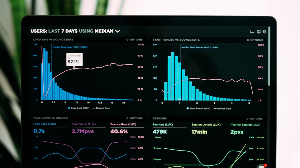
Every Monday, someone on your team spends hours pulling numbers from five different tools into a spreadsheet that six people glance at and forget by Wednesday. Automated internal reporting doesn’t just save those hours. it delivers insight faster, catches anomalies while they’re still fixable, and frees your team to act on data instead of assembling it.
Manual reporting has three costs that rarely show up on a budget line but add up quickly:
Time spent. Pulling figures from your CRM, accounting tool, project tracker, and a couple of spreadsheets, then reconciling them into one document, is routinely a half-day task for a competent ops person. every single week.
Error rate. Manual copy-paste between tools is where numbers quietly go wrong. A wrong cell reference or an out-of-date export doesn’t announce itself; it just sits in the report looking plausible.
Staleness by delivery time. Forrester’s research on operational reporting and similar industry analysis consistently flags the same pattern: by the time a manually compiled report reaches leadership, the underlying data can already be days old. A report built Monday morning from Friday’s export is describing a version of the business that’s already changed.
None of this is a skills problem. It’s an architecture problem. the report is being assembled by hand because nothing is doing it automatically.
Not every report deserves automation immediately. Prioritise by how often it’s built and how much it currently costs to produce:
Weekly KPIs and financial summaries typically deliver the fastest payback because they’re built most often and touch the fewest edge cases.
Three patterns cover most internal reporting needs, and picking the right one matters more than picking the most sophisticated one:
Scheduled pulls. The system queries your source systems on a fixed schedule (daily, weekly) and compiles a report. Simple, predictable, and the right default for most reporting that doesn’t need to be instantaneous.
Event-driven updates. Rather than waiting for a schedule, the report updates when something specific happens. a deal closes, an invoice is paid. Better suited to dashboards people check throughout the day than to a weekly digest.
AI narrative generation. Once the numbers are pulled, a language model writes the accompanying summary. “Revenue is up 8% week-on-week, driven mainly by the Acme renewal; churn risk flagged on two accounts”. rather than leaving the reader to interpret a table alone.
Most internal reporting for a growing B2B company is well served by scheduled pulls with AI narrative generation layered on top. Event-driven updates are worth the added complexity only when the report genuinely needs to reflect the current moment, not last night’s data.
The most common mistake in reporting automation is treating “automated” as the finish line. A report that auto-populates a table of numbers still requires someone to interpret it.
The more useful pattern uses the language model to do the interpretation work:
This is the difference between a dashboard and a report someone actually reads on a Monday morning coffee.
Match the format to who’s reading it, not the other way round:
| Channel | Best for |
|---|---|
| Slack digest | Daily or weekly team-facing summaries, quick scanning |
| Email report | Leadership summaries, external stakeholders, formal record |
| Dashboard link | Anyone who wants to explore the numbers themselves |
| PDF generation | Board reports, client-facing summaries, anything needing a fixed record |
A Slack digest that nobody opens because it’s the wrong format for the audience isn’t automation working. it’s automation solving the wrong problem.
Power BI, Looker, and similar platforms are strong choices once you have a dedicated analytics function and genuinely complex, ad-hoc reporting needs. For most SMBs, the actual requirement is narrower: a handful of recurring reports pulled from a handful of known sources, delivered on a schedule. That’s a lightweight automation problem, not a full BI platform problem, and building it that way avoids paying for flexibility you won’t use.
A typical example: connecting Xero (financials), HubSpot (pipeline), and Harvest (time tracking) into a single weekly report that lands in the CEO’s inbox every Monday at 8am, fully compiled, with anomalies already flagged. That’s a data pipeline problem combined with an ETL process moving data from three systems into one output, not a platform migration.
Start with the one report that costs the most time to build manually each week, not the most ambitious dashboard you can imagine. Automating that single report properly. connected to live data, delivered on schedule, with a written summary. usually proves the value quickly enough to justify automating the next one.
Ready to stop assembling reports by hand? Audit your reporting workflow with us, or explore how we build these systems as part of AI systems. Our managed systems support keeps the pipeline running when a source tool changes its API.